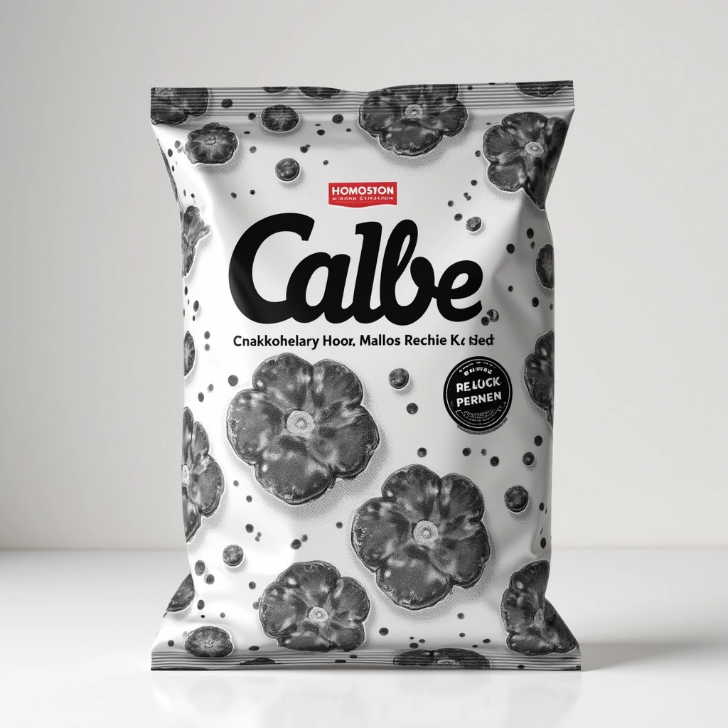
Hey there, snack aficionados! Grab a bag of chips (preferably Calbee, because we’re about to dive into the monochrome madness) and let’s chat about a rather peculiar turn of events in the world of munchies. Yes, you heard it right! Calbee, Inc., one of Japan’s largest snack manufacturers, has decided to embrace the black-and-white aesthetic for some of their product packaging. Why, you ask? Well, it seems that good ol’ material shortages have left them with a serious case of color ink envy!
Now, let’s take a moment to appreciate the absurdity of this situation. Here we are, living in a world where we can 3D print a burger, but a snack company can’t get its hands on some colorful ink? Talk about a plot twist that even the best anime writers couldn’t conjure up! It’s like waking up one day to find that your favorite ramen shop has decided to serve only plain noodles because, well, they ran out of soup. Who knew ink would become the new gold standard?
But let’s not get too bogged down in the details of supply chain woes. Instead, let’s revel in the beauty of Calbee’s monochrome packaging. It’s a bold move—like wearing socks with sandals but somehow still pulling it off. Seriously, black-and-white packaging is the new hipster trend we didn’t know we needed! Who says snacks can’t look chic? It’s like Calbee is saying, “Forget the flashy colors; we’re here for the flavor!” And honestly, can you blame them? It’s not like anyone actually eats the packaging (hopefully).
Now, if you’re wondering how consumers are reacting to this monochrome revolution, the answer is a mixed bag—kinda like a surprise snack pack! Some are totally on board, appreciating the minimalist vibe, while others are probably rolling their eyes and muttering about how they miss the rainbow of flavors. But let’s be real, folks: most of us are just excited that the snacks themselves are still delicious. If the chips taste good, can we really complain about the lack of color? It’s like saying you won’t date someone just because they wear beige. Get over it!
As we ponder this monochrome phenomenon, let’s also consider the environmental angle. With the world becoming increasingly aware of sustainability, perhaps Calbee is onto something here. Less ink means less waste, and who knows? Maybe this will start a trend where companies start stripping down their packaging to its essentials. Imagine walking into a store and seeing plain brown bags filled with snacks, all proudly boasting of their eco-friendly credentials. It’s the snacking revolution we didn’t know we needed!
In conclusion, whether you’re a fan of the classic colorful packaging or you’re ready to join the monochrome movement, one thing is for sure—Calbee has given us more than just snacks; they’ve given us a conversation starter. So next time you pop open a bag of Calbee chips, take a moment to appreciate the artistry of simplicity and the brave new world of snack packaging. And if anyone gives you a hard time about it, just say, “I’m enjoying my snacks in style!” Cheers to monochrome munching!