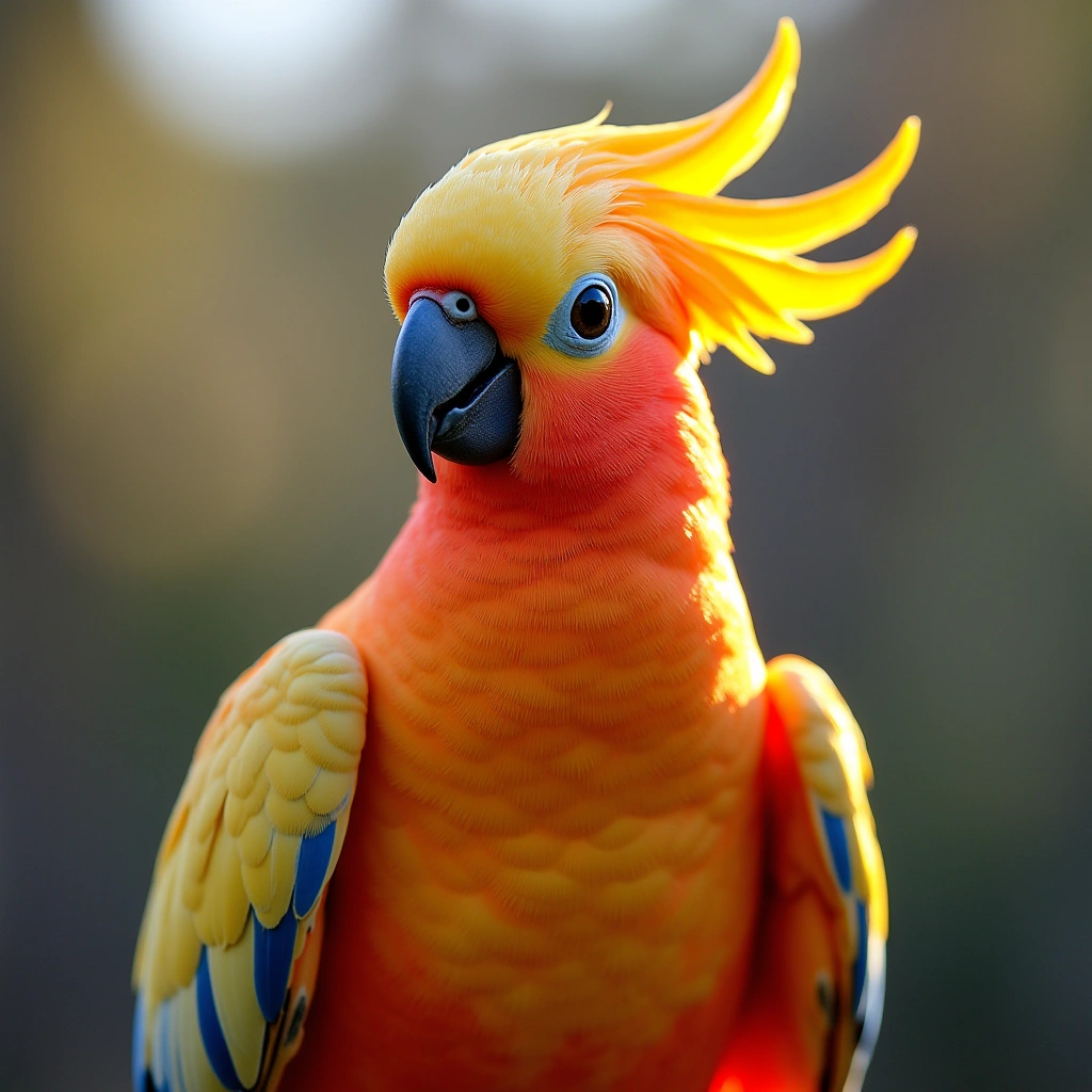
Brisbane 2032 Olympics Unveils Cockatoo-Inspired Logo Comments: 5 Brisbane 2032 has officially unveiled its Olympic and Paralympic logos, featuring a pink cockatoo-inspired design after an accidental early release.
When you think of Olympic emblems, you might picture grand symbols of strength, unity, and the thrill of competition. But in a delightful twist, the designers for the Brisbane 2032 Olympics have opted for something a bit more… cheeky. Enter the pink cockatoo, proudly flaunting its crest to resemble a flame — because nothing says ‘let’s go for gold’ quite like a bird that looks like it’s having a bad hair day.
The creative minds at Landor, the agency behind this quirky choice, went through what can only be described as a birdwatcher’s version of ‘The Bachelor.’ They sifted through hundreds of potential images, each more serious and Olympic-themed than the last, before they finally had their ‘A-ha!’ moment. And what was that moment? Apparently, it was the realization that a flamboyant cockatoo could embody the spirit of the games better than any Olympic torch ever could. Who knew?
Andy Thomas, the creative director, has been quoted saying that this emblem wasn’t just a random pick from a hat; it was the result of an exhaustive search for inspiration. Imagine the brainstorming sessions! Picture a room full of designers tossing around ideas — a kangaroo? Nah, too predictable. A koala? Too sleepy. But a cockatoo? Now that’s a conversation starter!
For those who might be wondering why they didn’t just stick to traditional symbols, it seems the designers wanted to reflect a bit of Brisbane’s personality. The city is known for its vibrant wildlife and laid-back charm, and what better way to showcase that than with a cheeky bird that seems to have its own sense of flair? This pink cockatoo is not just any bird; it’s a symbol of fun, resilience, and perhaps a little bit of mischief. It’s like the friend who shows up to a serious event wearing a Hawaiian shirt — they might not fit the mold, but they sure know how to lighten the mood.
Moreover, the cockatoo’s crest mimicking a flame adds a layer of cleverness to the design. It’s not just about looking good; it’s about symbolizing the passion and energy that the Olympic and Paralympic Games ignite in athletes and fans alike. So, in a way, this emblem is a fiery tribute to the spirit of competition, cleverly disguised as a bird with a personality.
In conclusion, while some might roll their eyes and think, “Seriously, a cockatoo?” let’s take a moment to appreciate the creativity and humor behind this choice. It’s a bold move that sets Brisbane apart and invites everyone to join in the fun — because, let’s face it, who wouldn’t want to cheer on a team represented by a flamboyant, pink bird? So, here’s to the cheeky cockatoo, the unexpected hero of the Brisbane 2032 emblem. May it inspire athletes to soar to new heights, and may it remind us all that sometimes, the best ideas come from the most unlikely places.
Inspired by: “‘The living flame’: Why Brisbane 2032 emblem designers chose a cheeky cockatoo” (r/Local)