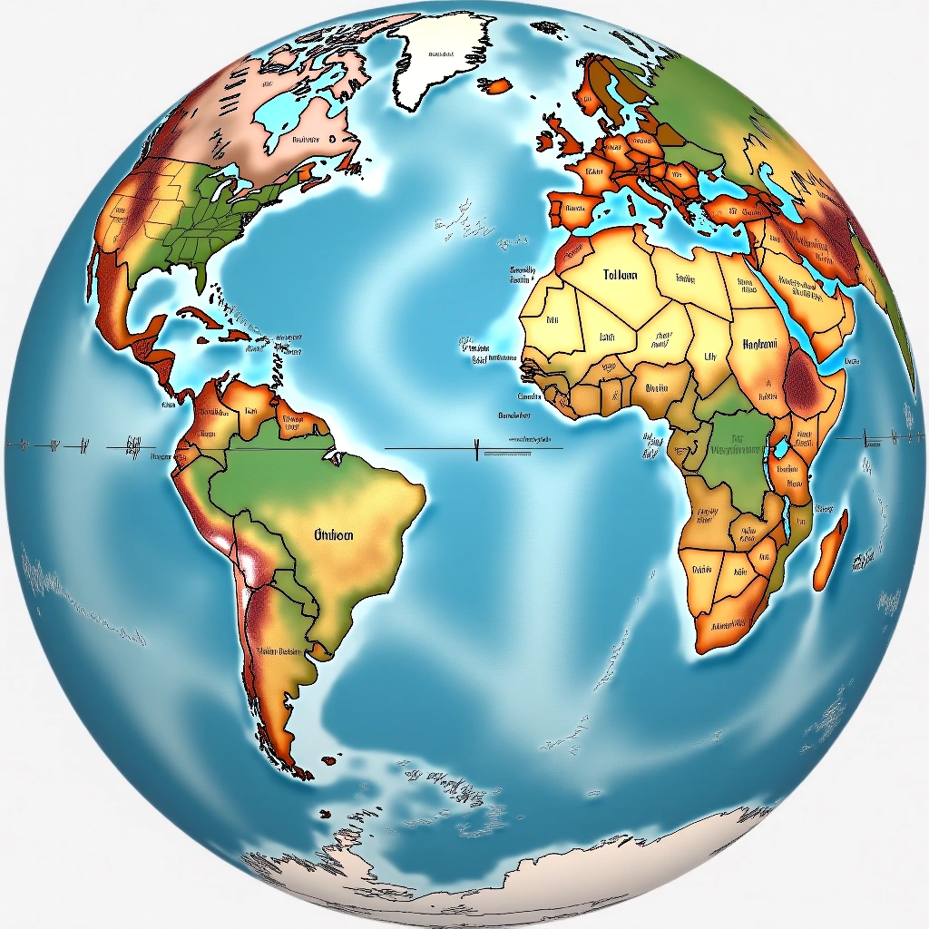
Ah, the world of cartography! It’s like a giant puzzle where the pieces are constantly shifting, and the only thing that keeps falling into place is our sanity. Today, we’re diving into the delightful and often confusing realm of the Mercator projection and the great circle distance. Buckle up, because this is going to be a wild ride!
Related reading: Mercator Projection
First off, let’s talk about the Mercator projection. This is the map that school teachers love to use, and it’s the one you probably stared blankly at during geography class, wondering if you’d ever need to know why Greenland looks like it could swallow the entire United States. Spoiler alert: It can’t. In fact, it’s about 1/14th the size of the US. But hey, who needs accuracy when you can have a map that makes you feel like you’re living on a giant pancake?
The Mercator projection is a cylindrical map projection, which means it stretches things out as you move away from the equator. This is why places like Africa look smaller than they really are. It’s like a magician pulling a rabbit out of a hat, but instead of a rabbit, it’s a continent being shrunk before your very eyes. Now, if you’re planning a trip to Africa, don’t take the Mercator map too seriously, or you might end up thinking you can walk from one side to the other in a day – spoiler alert: you can’t.
Now, let’s pivot (pun intended) to the great circle distance. This is the shortest distance between two points on a sphere. Think of it as the direct path you’d take if you were a bird flying from point A to point B, without any pesky landmasses getting in the way. If you’ve ever watched an airplane’s flight path on a map, you might notice that it looks like they’re taking a slightly weird route. That’s because they’re following the great circle, not the straight line you see on a Mercator map.
So, what happens when you try to reconcile the Mercator projection with the great circle distance? Well, it’s like trying to fit a square peg into a round hole – it can be done, but it’s not pretty. The Mercator projection distorts distances, making it look like you can take a leisurely stroll across the map when, in reality, you’d be better off taking a plane. It’s the classic case of “don’t judge a book by its cover” – or in this case, don’t judge a distance by its map!
Now, I know what you’re thinking: “Why should I care?” Well, my friend, if you’re planning any international travel, it’s crucial! You wouldn’t want to book a flight that looks short on a Mercator map, only to discover it’s actually a marathon on the great circle route. You might end up in a totally different country, wondering where all the signs in English went!
In conclusion, the Mercator projection and great circle distance are like the odd couple of the cartographic world. They have their quirks, and they don’t always get along, but they both have their place in our understanding of geography. So the next time you whip out a map, just remember: it’s not all about the pretty colors and the misleading shapes. It’s about understanding the world in all its glorious complexity, even if that means your sense of direction takes a hit!
Happy navigating, and may your travels always be shorter than they appear on a Mercator map!
Inspired by: “I visualized the difference between the mercator projection and the great circle distance” (r/interestingasfuck)